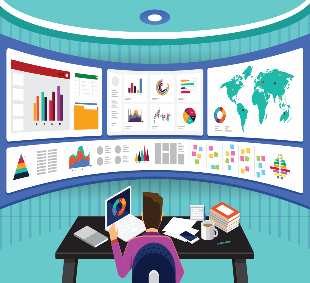
The best practices in data visualization. Nowadays the rapid advancement in technology has brought about a lot of progress in computer hardware. The best practices in data visualization. It is a recorded fact that around 1 TB of data is generated in a year and most of it has been converted into digital form. You can easily record and store this data with the help of monitoring systems and sensor tools. Machines generate a lot of data. Yet previously there were no ways of exploring it and it has ultimately led to data “dumps”.
So what is data visualization?
This is a visual method in which raw data perceived can be represented for its users to evaluate a study and come to certain conclusions. It can be in the form of charts, maps, and graphs. Now examining this data becomes easier as it is now in the form of a simple image. Even the scrutiny to ensure that no data has been lost in the process becomes simpler. Make sure that it produces no exaggeration in data.

So visualizing your data in more perceivable forms like graphs, charts, and bar diagrams will help you become a more effective communicator. However, you need to maintain some specific guidelines because it will increase the effectiveness of the message you wish to convey. So here are some of the best data visualization practices that you can follow to present your data and in a visually pleasing and comprehendible manner.
1. Find your target audience: (Best practices in data visualization)
The most crucial part of data visualization is knowing who are visualizing it for. Depending on your audience, you would have to tailor the method to ensure they are capable of understanding it. It’s best to know who you will be doing it for because you can customize the method. This process information effectively. The top 10 tips to increase the NPS survey response rate.
Misunderstanding and problems will occur if the interpretation of the image shifts from the conveyor’s purpose. Resist the temptation to form such a dashboard that will be used by all types of users and tailor them accordingly.
However, those who know your project will understand the statistics in your data visualization charts. Still, someone new to it may have a problem figuring it out. So customize it differently especially for them
2. Make the correct choice of visualization depending on the data:
These types of data work even better with improved visual features.The 3 types of data in data visualization are as follows-
- Quantitative- Defines how much is present in a particular thing
- Ordinal – Data has logical sequence and accorded together
- Categorical- Data belonging together
Like, for non-ordinal data, line charts are a poor choice. It works better with ordinal data, although it implies continuity in non-ordinal ones. Again scatter plots work best with 2D or quantitative data. So make sure you are clear on which type of data you need to visualize.
3.Ensure your data is clean:
Ensure the datasets are clean before using your data for visualization. Data cleaning is basically a process where you can filter the abnormalities and inaccuracies present in your data. Inaccuracies can skew your visualization and will change the interpretations of it as well. Create Google forms
Verify that the correct computation of your data is maintained before planning to publish a set of figures.
The general audience is your toughest viewers as you need to create an extremely simple and possibly tentative graph that mostly shows the essential aspects of your analysis.

4. Provide context and keep it simple:
In this advanced era of technology, we automate most of our tasks. However, sometimes you need to provide reviews and recommendations. For this, you need to convey the context of them and trust it so that a final determination occurs.
To drive an action it is essential for the viewer to believe the comparison is done with something tangible like a benchmark from a previous goal.
Make the data representation more comprehendible by using signs like-colored arrows, visual cues, or simply plain texts to help viewers interpret the entire information at a glance. Create an online survey and make your survey attractive.
Also, you need to keep your content simple enough for better and broader interpretation and the same applies for your dashboard too. Create designs that enhance the impact of your data visualization practices. This enhanced visualization would help in:
- Understanding the overview of high-level information
- Respond to questions effectively with data visualization
- Viewers can assist themselves with improved information
5. Strive to keep your viewers engaged:
Similar to how your calendar assists you in your daily activity, and here are some ways in which your data visualization practices will keep your viewers engaged:
- Regularly schedule your email reports
- Notifications which are metric-driven
This enhances the continuous engagement and calls to action. When your viewers have daily e-mail reporting, they will need to explore your dashboard and in thorough detail. Whenever the dashboard is noticed to drop below the said threshold, and notifications will be automatically triggered which will urge them to take immediate action.
Moreover, the top data practices which ensure your success includes being clear of your goal and using accurate data and keeping your content and dashboard simple, and designing in such a way that it keeps your users engaged. Alternatives of Survey Gizmo.
Thank you for reading the entire article with utmost patience. Please do leave a comment down below and share with us your views regarding the topic. It would be great to hear from you. Feel free to offer any suggestions that you want to share with us. We will be absolutely delighted to hear your suggestions and improve our content.


